Supertails · Cart revamp

Product design case study · 2026

E-commerce · Product design

Making a complex cart feel easier to buy from.

A cart can contain multiple deliveries, prescription checks, competing offers and incomplete checkout details. My focus was to make the next decision clear.

Average order value

plus 5.65 percent

₹2,076Control
₹2,193Revamp

+₹117per order, on average

Coupon application

plus 8.36 percent

Revamp54.1%
Control49.9%

Rings show the rate out of 100%.

A golden retriever and a tabby cat sniffing a just-delivered cardboard box at the front door
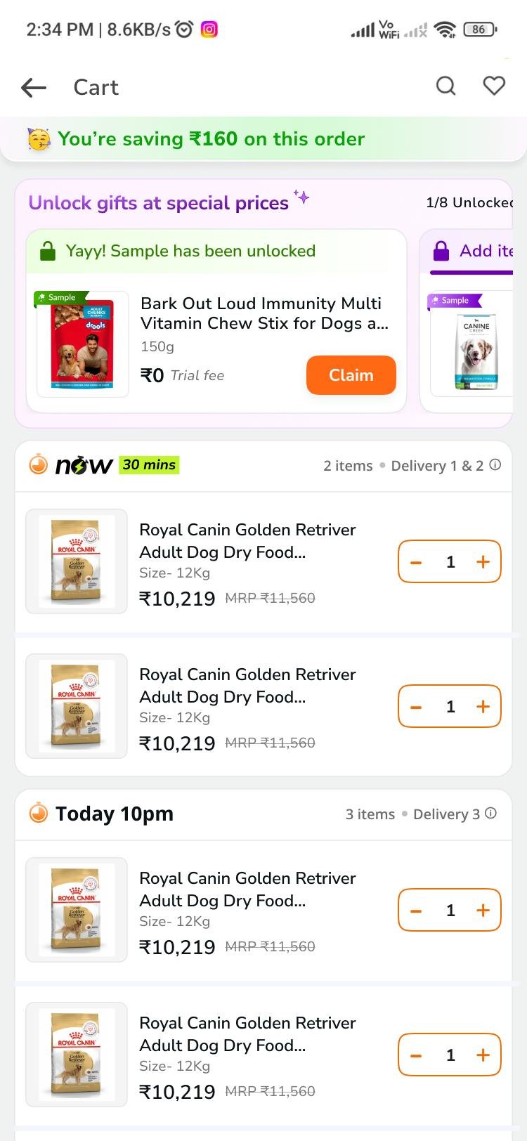
Revamped Supertails cart: savings banner, gift module and the first delivery group
Revamped cart · design file

01The problem

The cart had everything, except clarity.

Too much complexity was competing with the decisions shoppers needed to make before checkout.

Delivery clarity

One order can arrive in several deliveries.

Impact
Shoppers have to infer which items arrive when.
Opportunity
Explain fulfillment through delivery groups.

Savings transparency

Applied and available savings compete for attention.

Impact
The final price needs extra interpretation.
Opportunity
Show coupon impact and applied state.

Pharmacy verification

Prescriptions introduce conditional delivery.

Impact
Next steps and recovery can feel uncertain.
Opportunity
Make verification visible and editable.

Checkout readiness

Login, location and payment states vary.

Impact
Redundant taps or inaccurate delivery expectations.
Opportunity
Guide the user to the next valid action.

Business goals

  • Better cart-to-payment progression
  • Fewer drop-offs
  • Fewer confusion-related support contacts

Goals set for the work, not proven outcomes.

03The solution

A cart that answers the last questions before payment.

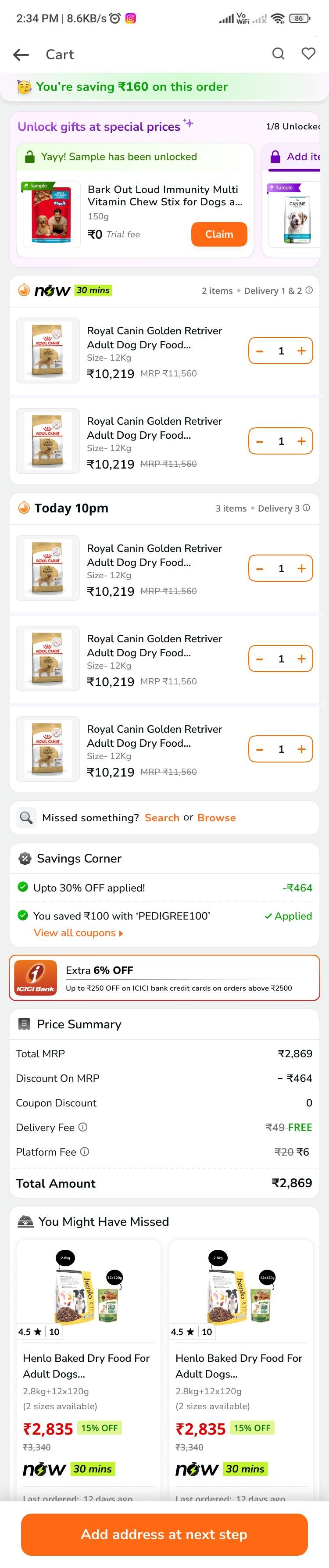
The revamp reorders the cart around what a shopper has to decide: delivery first, then items, then money, then the next valid step.

  1. 1
    Group by deliveryOne header per delivery, with its item count.
  2. 2
    Keep EDD near its groupSpeed tier and arrival sit in the group header.
  3. 3
    Compact product rowsSmaller imagery. Quantity controls stay.
  4. 4
    Attribute savingsEach applied offer shows what it's worth.
  5. 5
    Use the next valid actionThe footer CTA follows the shopper's state.
!

Before: "Order will be delivered in 2 deliveries", yet both items read "Delivery by Today, 2pm". Shoppers had to work out what arrives when.
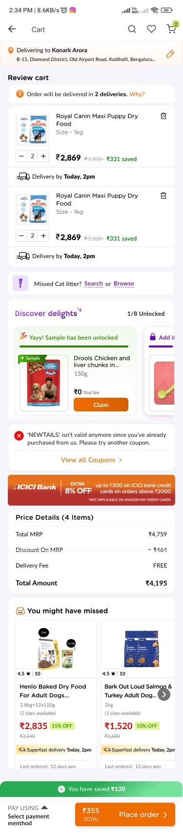
Previous Supertails cart, full length!
Previous cartOriginal design fileItem-level EDD, a split-delivery notice and prominent product controls.
Revamped Supertails cart, full length12345
Revamped cartUpdated design fileScroll the screen for 4 and 5
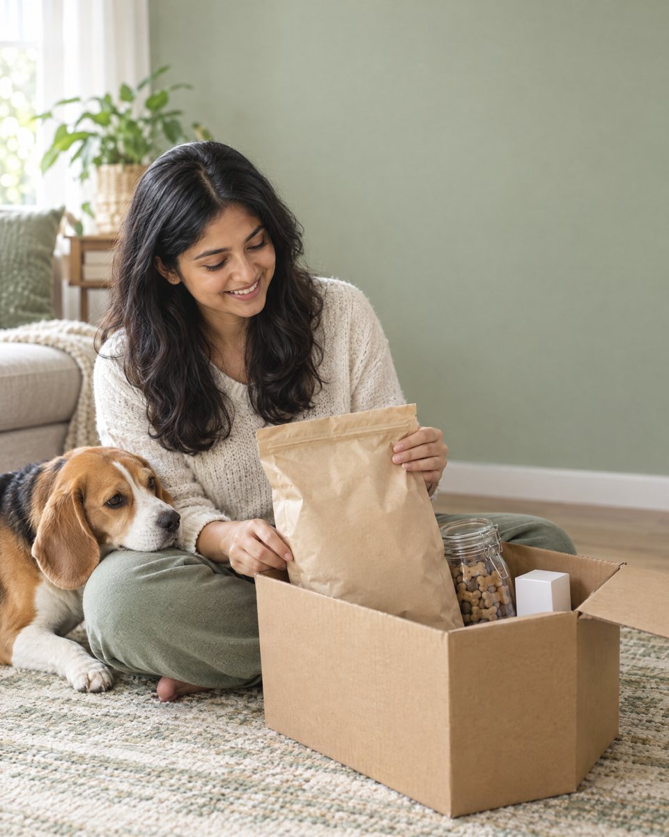
A pet parent unpacking dog food, treats and a pharmacy box while her beagle rests on her knee

04How we got there

Work backwards from the pet parent's questions.

Every element in the revamped cart maps to one of six questions a pet parent asks before paying.

  1. 1
    What am I buying?Compact rows: product, variant, quantity, price.
    Products
  2. 2
    When will it arrive?Delivery groups with count, speed tier and EDD.
    Delivery
  3. 3
    What am I saving?Applied and available offers, fees, payable total.
    Offers + price
  4. 4
    What blocks checkout?Prescription, login, address or payment state.
    Pharmacy
  5. 5
    Is this location valid?Coordinates confirmed before an EDD is promised.
    Address
  6. 6
    What happens next?One state-specific primary action.
    Checkout

05Key design decisions

Put the answer next to the question.

Five decisions carry most of the weight. Crops are from the revamped design file.
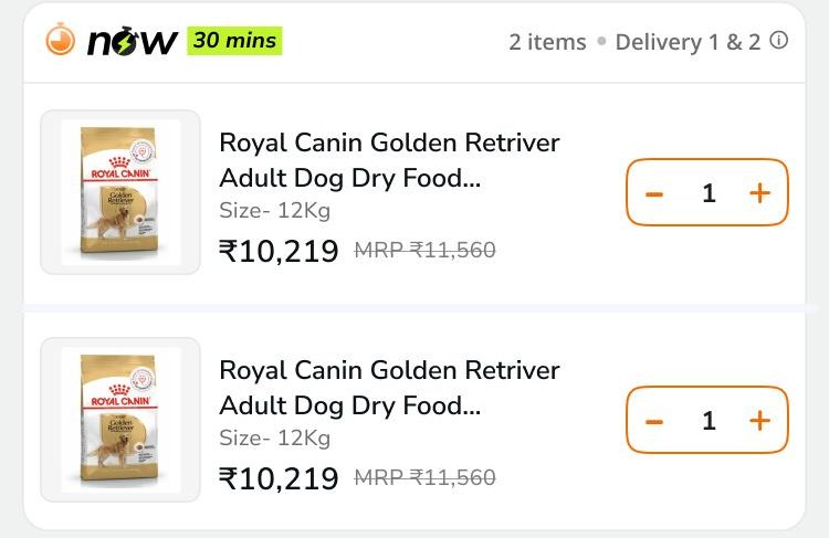
Delivery group header reading now, 30 mins, 2 items, Delivery 1 and 2, above two compact product rows
01

Group by delivery

One header per delivery shows what arrives together, with the shipment count always visible.
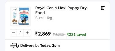
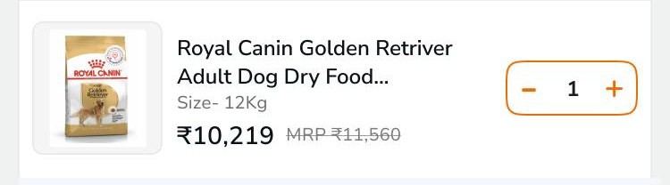
BeforePrevious product card with large image, quantity stepper and per-item delivery lineAfterRevamped compact product row
02

Compact product rows

Smaller rows make room for delivery context. Quantity controls stay.
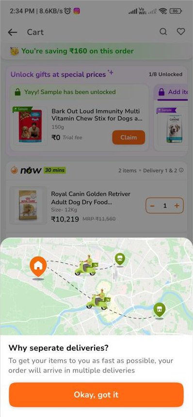
Bottom sheet titled Why separate deliveries, explaining the order will arrive in multiple deliveries
03

Keep EDD near its group

Speed tier and arrival time sit in each group header. An info icon explains why items split.
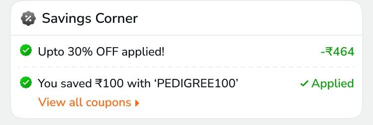
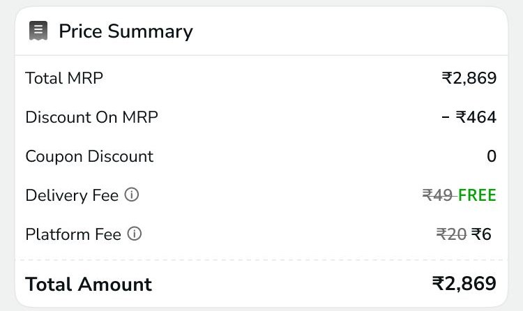
Savings Corner showing 30 percent off applied and a coupon marked AppliedPrice summary with MRP, discount, coupon, delivery and platform fee lines
04

Attribute savings

Offers and coupons show what each one saves. The price summary lists every line.

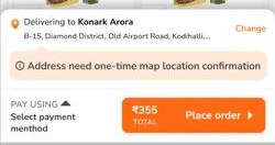
New shopperFooter button: Add address at next stepSaved address, missing coordinatesFooter asking for one-time map location confirmation above Pay using and Place order
05

Use the next valid action

The footer button follows the shopper's checkout state, not one generic button that fails later.

06State design

Recovery is part of the primary experience.

This is not a visual refresh. It's a system of states, each designed up front rather than patched in later as an error.
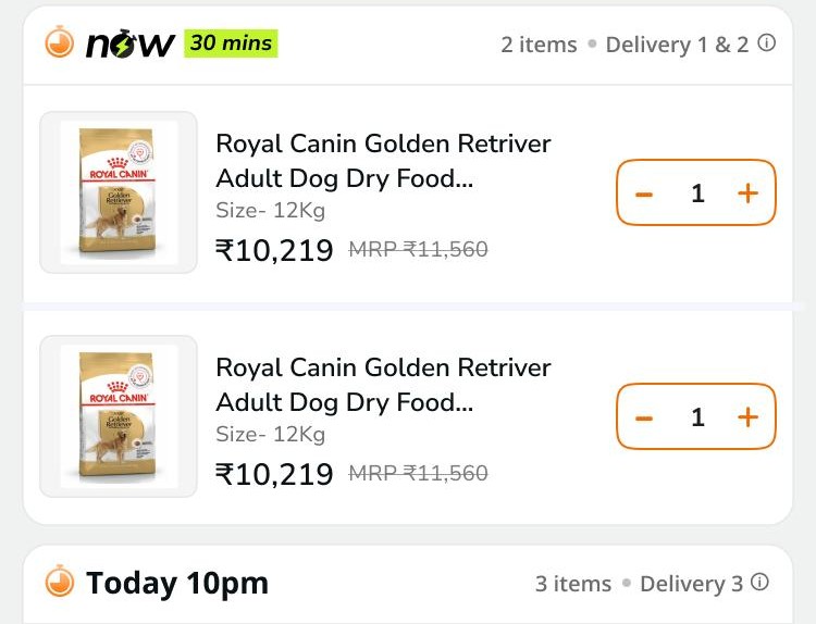
Two delivery groups: now, 30 mins with 2 items as Delivery 1 and 2, then Today 10pm with 3 items as Delivery 3

Delivery groups

  • Different EDDs in one order: each group carries its own arrival promise.
  • Same EDD, separate shipments: keep delivery identity and count.
  • NOW · FAST · EXPRESS · STANDARD: consistent tier placement beside the actual EDD.
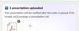
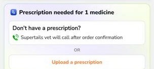
Prescription needed for 1 medicine, with a vet-assistance option and an upload button1 prescription uploaded, verified after the order is placed, with option to add more

Pharmacy verification

  • No prescription: upload, or take the vet-assistance path.
  • Uploaded ≠ approved: upload and verification stay separate; EDD stays conditional.
  • Wrong document: delete and re-upload with clear status.
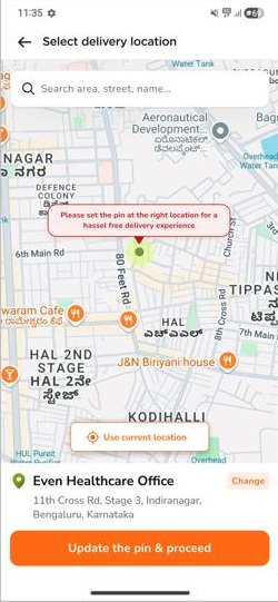
Cart footer flagging that the address needs one-time map location confirmationSelect delivery location map with Update the pin and proceed

Location confirmation

  • Saved address, no coordinates: block progression; confirm the location first.
  • Valid saved address: reuse details, keep a change affordance.
  • Logged out or new: guide login and address with an accurate CTA.
Savings Corner with applied offer and applied couponFooter with delivery address, Pay using, select payment method and Place order

Offers + payment

  • Coupon available or applied: show benefit, applied state and total change.
  • Saved payment: surface the chosen method with a way to change it.
  • No payment selected: open payment selection before the order commits.

07Reported outcome

Shoppers spent more and used more offers.

A/B test, Jun 25 – Jul 7, 2026 · 36,331 units.

Average order value

+5.65%

Control₹2,076Revamp₹2,193

Coupon application

+8.36%

Control49.9%Revamp54.1%

A pet parent shopping on his phone on the sofa, his dog and cat beside him

Relative change, revamp vs control. Raw data wasn't available, so no causal revenue claim is made.

08Learnings + next steps

Clarity is the outcome to protect.

What this work taught me, and what still has to happen before the story is complete.

01Operational complexity shapes the interface.

Split fulfillment and verification decided what the cart had to explain. Delivery groups make that model visible.

02Edge cases belong in the architecture.

Location and prescription states change what checkout can promise, so they were designed as states, not patched in as errors.

03Fewer taps alone is not success.

The next action has to be understandable and safe, not just one tap closer.

04Higher spend needs its economics checked.

AOV and coupon use rose together, so discount cost has to be read alongside the gain.

Portfolio takeaway

A state-aware cart that explains delivery, money and readiness, supported by transparent evidence.

What I owned

  • Identified the system-level complexity behind the cart.
  • Reframed the cart around shopper questions.
  • Designed for multiple fulfillment and checkout states.
  • Connected UI decisions to operational constraints.
  • Treated recovery states as part of the primary experience.
  • Read the outcome with the evidence it has, and named what it doesn't.

Sources: Cart Revamp project page and use-case framework, previous and revamped design files, and the embedded A/B report. Prices and savings in the screens are mock design content; they don't all reconcile and are not transaction data. Lifestyle photos are AI-generated.

Process and research detail